Hunting for the desired product is hard to imagine without a proper search engine. Users type in their requests in Google search and discover available online stores.
But how do you help them navigate when arriving on the website? Customize Magento on-site search or the one for your CMS to aid visitors to find what they need.
It’s like coming up to a sales assistant and asking, “Do you have a sink strainer (insert anything else here)?”
It makes shopping smoother, faster, but at the same time, people will want to spend more time in the store due to the pleasing user experience it provides.
Statistics prove that on-site search increases conversions by 80%. Thanks to the search box, the average of 2.77% of conversions turn into 4.63%.
So you understand the importance of incorporating an eCommerce site search engine, right? But it’s not enough to drop the box somewhere on a homepage and wait for conversions to rise.
Site search goes beyond the search bar. It combines an understanding of user requests, autocomplete, search by synonyms, and more.
Let’s discuss what a successful eCommerce site search looks like.
5 Tips to Leverage Ecommerce Site Search for Better Conversions
1. Make the Search Bar Distinctive
How do you expect visitors to utilize the search bar if they don’t find it? An easy-to-spot box is what users will turn to when arriving on the website.
That’s why you should place the search box above the fold. How can you highlight the search functionality without dragging attention from the website?
Remember that placing the bar on each page is crucial. But note that you shouldn’t use it on the checkout page.
Product pages or a blog attract people who are in the process of searching for something.
In turn, checkout should lead purchasers to order completion, so any distraction may ruin your efforts to convert buyers.
The screen space is limited, and savvy marketers want to display the most enticing content upfront while saving on the unnecessary elements.
How big should the search bar be? Do you need to show the whole bar at all? A magnifying glass icon can be better than a long line in some cases.
Nevertheless, give your search functionality extra space. This way, the visitors won’t lose it in the thread of categories.
As for entering the request, words shouldn’t be hidden while typing. Make the box big enough to see the entire phrase to edit it easily.
Does the bar take up too much space? Employ a small loupe pictogram and expand the box after clicking on it.
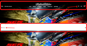
Troy Lee Designs acts like that. All the menu elements disappear when visitors click the “Search” button. The area becomes more extensive and white to make the text and results more visible.
However, there is enough space to display the search bar on the desktop version, and it’s better to opt for it rather than an icon.
The screenshot was taken on the official Troy Lee Designs website

2. Make It Effortless to Search from Mobiles
The growing number of mobile users affects how online merchants develop their websites. That’s why some build their stores with a mobile-first approach in mind.
They configure user-friendly website navigation, place the menu at the bottom of the screen, or allocate crucial buttons, such as “Add to cart” or choosing the size, to be convenient to tap with a thumb.
That’s where mobile search comes in. People use smartphones to access something on the go.
Generally, conversions or purchases happen from a desktop, but this tendency gradually changes.
According to numbers, mobile commerce sales are bringing higher revenue every year. It means that improving the mobile experience is a must.
How should you configure mobile search? The general rule is to ensure the visitors won’t tap the wrong link.
The magnifying glass should be large enough because going to the incorrect page irritates and leads to higher bounce rates. The same goes for product results.
People will see one or two products per screen without scrolling. So it makes sense that the return should be highly relevant to their request.
Below is the Mpix™ website, accessed from a smartphone. The search button is as big as the cart.
Other options are inside the burger menu, so they don’t take space on the screen. Here we can also assume that the space allows for a search box instead of the pictogram.
The search function appears in a pop-up. This move enables visitors to focus on the searching process. The system suggests autocompleting the query. It speeds up the process as you don’t have to type it till the end.
Screenshot taken on the official Mpix™ website

3. Discern Mistyped Queries in Ecommerce Site Search
Anyone has the right to make mistakes. When prospects type the request, they may misspell the words, and “a trolley case” becomes “a ttoley caes”.
It applies to the situations when you look for something on the go. That’s where the website should untangle errors to ensure a smooth user journey.
I’ve seen many pages returning a 0-results page. On average, if users misspell a single character in the product title, 34% of the top 50 eCommerce sites fail to process it.
How can you cover typos? Make a list of alternative spellings or employ natural language processing (NLP) and machine learning.
These technologies mimic human behavior, analyzing and understanding the request. You’ll meet your customers’ needs and increase the time spent on the website, reducing a bounce rate.
Look at the YOOX screenshot below. I’ve typed “ornge lether bag”, making two mistakes in one query.
But the website grasps what I intended to get and shows suitable items. Their search function is worth noting from every perspective.
Have you noticed the numerous sections it offers? You can choose from the best match, designers, categories, color, and details. The results aren’t just a list of links. A selection of goods is enriched with images.
Screenshot taken on the official YOOX website

4. Image and Voice Search as Ecommerce Site Search Best Practices
Image and voice search caters to those who don’t want to use any manual keyboard input. Image or visual search is the ability to upload or take a photo and find similar products in the store.
A potential client uploads the image onto the eCommerce site search engine. It triggers the system to look for the best matching items and make personalized recommendations.
Visual search has gained traction because it provides a simple way to find what you want without typing. You don’t need to know how to name a product.
The system will process the picture to return excellent search results. That’s how ASOS implements image search.
Press on the camera icon, and you’ll go to the page with recent history and two options to choose how to upload a photo. After uploading the image, the app shows products you can filter and sort.
Screenshot taken on the official ASOS mobile app

Ecommerce voice search is a hands-free option to look for a product, similar to talking to a voice assistant such as Apple’s Siri or Amazon’s Alexa.
But in this case, you press the microphone button on the website and speak. Voice search relies on AI voice recognition, working on the intersection of computing and linguistics to decipher a person’s words, phrases, and phonemes to differentiate one word from another.
5. Enable ML-Powered Personalized Recommendations
Machine learning (ML) is a computer’s ability to teach itself via experience without human intervention.
It leverages artificial intelligence (AI) to discover patterns and utilize them to self-improve. What can be a source of data for ML? These include previous shopping and browsing histories.
The system chooses the products which will suit a customer best depending on what they or people with similar interests bought, liked, or added to the cart.
These actions help customize the shopping experience or predict customer behavior. As a result, prospects enjoy personalization while looking for goods and services.
The website, in its turn, can forecast what they will buy depending on what’s happening in their lives, whether they buy sports, animal, or car products.
Suppose you looked for dog food. The website will presume you have a dog and provide other related supplies, such as costumes, harnesses, or toys.
Boost personalization by suggesting coupons and discounts to registered customers for dog-related products. That’s how personalization helps eCommerce businesses increase repeat purchases on the website.
Below you can see the Williams-Sonoma example. The website displays the also-browsed products gaining insights from other customers.
Screenshot taken on the official Williams-Sonoma website

Conclusion
Why is it so important to devote time to eCommerce site search? Because it helps website visitors to find the product they intend to buy faster.
Just like an assistant in a store leads a customer to a shelf with the necessary goods.
Search data is also a valuable source to know what your customers look for (and add it to your assortment if they can’t find it).
You can analyze the statistics of what they open, buy, or omit. This knowledge can help you improve the website and predict other customers’ preferences.
Place a search bar where it’s easy to notice, optimize for mobiles, and identify what users mean if they mistype the word.
Allow potential clients to use visual or voice search and configure personalized sections. This way, you’ll make their shopping experience as seamless as possible and build trust in the years to come.
Read More:
- Why SEO Still Matters for Your Entire Digital Marketing Strategy
- How To Increase Sales In Ecommerce Stores?
- How Email Marketing Is Important for E-commerce Store?


